Home » Forums » Photo feedback » Fence in photos
Fence in photos
Javier González   Full member Joined in August 2009 Posts: 21 |
Posted 5 November 2011 - 13:51 CET |
|
A question : photos with fence like that one are ok for A-P.net ?
Thanx
Javier Attached photos:  |
Michael Carbery   Full member Joined in June 2008 Posts: 1138 |
Posted 5 November 2011 - 14:29 CET |
|
Hi Javier the problem with screening is that it is subjective i.e. what I like another screener might not. What another screener rejects I might accept. The same is true with fences, some screeners will tolerant them as long as they're not too intrusive, while others just hate them. As for your image I don't think it's too intrusive, it's isn't brightly coloured or taking the focus of the Airbus. I'd be happy to accept it if I was screening it but maybe some other screeners can give their views. |
Martin Krupka  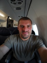 Founder Joined in July 2006 Posts: 1156 |
Posted 5 November 2011 - 14:40 CET |
|
Javier, I am probably the toughest on fences and I would reject the photo. :-) The fence seems too dominant to me, particularly the fence structure in the middle. I see that you are a Full Member and I appreciate that you ask for the opinion to maintain the site standards consistent. |
|
Michael Carbery Full member Joined in June 2008 Posts: 1138 |
Posted 5 November 2011 - 15:02 CET |
|
lol that's me shot down :) |
|
Martin Krupka Founder Joined in July 2006 Posts: 1156 |
Posted 5 November 2011 - 15:08 CET |
|
Sorry Michael, I did not mean to. As you said what one screener accepts another one might reject and the other way round. |
|
Javier González Full member Joined in August 2009 Posts: 21 |
Posted 5 November 2011 - 15:37 CET |
|
For me to be a Full member is not a reason to upload all without limits, it's necessary also a feedback with editors and screeners, and that is more easy with new forum and the possibility to upload images to speak about. :-) Javier |
Stuart Lawson   Full member Joined in February 2007 Posts: 16 |
Posted 5 November 2011 - 15:41 CET |
|
For me i would see the fence as a minor problem ... and with a about 5 mins work ... it can be easily cloned out with the back ground that it sits against ... Then just think how much your image looks with out it removed ...
But some are easily to get rid of others .. and depends on the background as well ... |
|
Javier González Full member Joined in August 2009 Posts: 21 |
Posted 5 November 2011 - 15:54 CET |
|
Only 5 mins. for clonning all the fence ? wow ! I'll try but I don't know if really easy to clon
|
|
Stuart Lawson Full member Joined in February 2007 Posts: 16 |
Posted 5 November 2011 - 20:45 CET |
|
Ok ... i hold my hand up .... maybe not 5 minutes ... but a few minutes ... but certainly will make it look alot better ...
|
Tony Marlow   Full member Joined in August 2006 Posts: 136 |
Posted 5 November 2011 - 21:54 CET |
|
The way to approach an image that you want to upload to A-P is to think of it as a "photograph" rather than just a picture of a plane. Would you be happy with the fence if it was a wedding picture for example? |
Wallace Shackleton  Full member Joined in February 2007 Posts: 1897 |
Posted 6 November 2011 - 06:17 CET |
|
Why have the fence in the picture at all? Why not have the A380 lower in the frame and show more of that beautiful blue sky?
There is no rule to say that an aircraft has to be EXACTLY in the middle of a photo. We carry so many self inflicted crosses on our backs and so much useless heavy baggage from other sites that we forget that photography is all about being creative and it is good to break the rules and being creative. I would probably have accepted this photo had I screened it, although with a message that you crop too close.
Five minutes work. There is a wee nit of the fence still showing in the bottom left hand of the picture.
I have left a tell-tale line just above the tail to show what the expanded canvas, normally I would have cloned this out. Three minutes work. |
|
SkyDave Full member Joined in December 2007 Posts: 13 |
Posted 6 November 2011 - 10:04 CET |
|
I suppose this really comes down to a balance of what the photographer can do. For example, the A380 shot is easily sorted, for much closer in shots it's not so easy, particularly at air shows and where the organisers insist in using hi viz chains, fences and cones. Some are easily dealt with, some not, my preference is that if he a/c is too close to the fence/ chain, I tend just to move on and put it down to experience.
Just my tuppence worth |
|
Javier González Full member Joined in August 2009 Posts: 21 |
Posted 6 November 2011 - 14:06 CET |
|
Finally I took more than 30 mins. to clone all the fence, I think the right side with wires over the road is quite well... also the center seems good My mistake : I don't see the hole photo to avoid the symmetrical "clonning pattern" on left bottom border.
Anyway I think is few visible with a 380 at 1600 pix if you don't now the secret :-)
I don't like uncentered aircraft in "normal" pictures if I can avoid it, and there's also some vignetting in sky,
Thanks for advice and comments, Javier |
|
Martin Krupka Founder Joined in July 2006 Posts: 1156 |
Posted 6 November 2011 - 15:20 CET |
|
Quote Javier González: I don't like uncentered aircraft in "normal" pictures if I can avoid it... I agree with this. Photos that are uncentered without any justification look unbalanced. |
|
Wallace Shackleton Full member Joined in February 2007 Posts: 1897 |
Posted 6 November 2011 - 20:29 CET |
|
I did not add any vignetting, it is all from your picture, all I done was stretch it up.
I see this a lot in the database, aircraft dead center with the tails clipped and a useless piece of ground. Why include a piece of ground that no one is interested in? One piece of airport is just as boring as another.
See when you think about it. You stand on a level piece of ground and look straight ahead what do you see? About a third of what you see is ground and the rest is sky, so why do photographers insist on having half and half?
Honestly, I think it's because we have been conditioned to think that that's how photos should look. A layer of Boeing in between a layer of ground and sky is not natural to me, it's poor composition. When one says balance what you really mean is half ground and half sky I fear that this attitude came about from people who tried to standardise on screening without necessarily being a photographer first.
The way I see it, there is more to the picture than the aircraft, the cloudscape and scenery are just as important as the subject and please do not get me wrong here, who wants to look at a concrete underpass in a picture. You were standing where you were because you wanted to take a picture of the aircraft not the underpass, certainly not the fence.
No doubt I'll be put up against a wall and stoned with 35mm film cassettes for such sedition. |
|
Wallace Shackleton Full member Joined in February 2007 Posts: 1897 |
Posted 6 November 2011 - 20:34 CET |
|
Just to comment on David's point. I'm a great believer in simplicity, so I will clone out any clutter that I can from a picture; cones, signs, taxyway markers and windsocks are all fair game to me. (I got a perverse pleasure getting one over on the a.net screeners with the odd piece of cloning.) ;) |
|
Paul Nichols Full member Joined in February 2008 Posts: 73 |
Posted 14 November 2011 - 18:15 CET |
|
Having the aircraft not centred is fine if there's a reason for it. In a case like this there's absolutely no reason whatsoever to put the plane anywhere other than exactly in the middle because there's nothing else going on in the photo. Putting it at the bottom wouldn't make it artistic, all it would do is make it conform with a perceived notion some people have that they can call any image even vaguely conforming to the rule of thirds art. This isn't the case. Photographic composition isn't about putting something somewhere in the frame because that's 'how it's done' (which is actually the exact mentality you argue against so vehemently, Wallace, just applied in a slightly different way). It's about balance. Why put it down in the bottom? Is there a gorgeous sunset behind it filling the upper part of the frame you want to show? Why put it in the bottom right third? Is there something in the top left third to balance it out? Simply putting the plane at the bottom of a standard image means absolutely nothing artistically, but if you can compose/balance your image creatively and with reason in such a way then you're getting there.
I don't want to sound too nasty saying this (and I'm not directing it at you, Wallace), but there's a huge gulf between being taught the standard ways of composing an image (i.e. rule of thirds) and naturally understanding it. Simply throwing the plane to the bottom of a standard image isn't effective composition, as Martin says it simply looks unbalanced. This post has been edited by Paul Nichols on 14th November 2011 - 18:17 |
Sebastian Fernandez Bielkiewicz   Full member Joined in August 2009 Posts: 4 |
Posted 14 November 2011 - 22:20 CET |
|
I have to agree 100% with Paul. |
|
Paul Nichols Full member Joined in February 2008 Posts: 73 |
Posted 15 November 2011 - 11:15 CET |
|
Tony, you raise a good point that I think is perfectly valid as long as the composition has been thought about and there's a reason for it. This site puts itself forward as the place for creative photography, but put quite simply, there's nothing creative about shoving the plane at the bottom of the frame without reason. Absolutely nothing creative whatsoever. Thinking about composition and placing the subject somewhere in the frame for a good reason shows creativity and an understanding of what you're actually shooting, but putting it at the bottom of the frame without reason looks like the composition hasn't been thought about at all. |
Trevor Ogle  Member Joined in January 2012 Posts: 5 |
Posted 24 January 2012 - 03:19 CET |
|
I have to agree with Wallace. I've had photographs rejected on other sites because they weren't perfectly centred. One of the first rules I learned in photography is to leave more space in front of a moving object than behind it to show motion. Seems like some of the screeners on other sites missed that part of the photography course This is a great site with some spectacular images - lets not get hung up on small details like horizon not level (I'm talking mm's) or more space in front than behind. That would just make this site like some of the others |
|
Paul Nichols Full member Joined in February 2008 Posts: 73 |
Posted 24 January 2012 - 11:34 CET |
|
Trevor, you've highlighted a problem perfectly - there are no rules, and assuming there are is a mistake many make. With respect, it's you that's missing the point of how many sites work, not them that's missing what you perceive as 'artistic' photography. The simple fact is that many sites work to standards for no other reason than in the interest of fairness when screening, and sites like A-P exist for those who don't wish to shoot in that particular style.
Rather than assuming the thousands upon thousands of people who upload to other sites are wrong or "missed that part of the photography course" (which to be honest is a pretty patronising thing to say), just stick to uploading to whichever sites you prefer. |
|
Trevor Ogle Member Joined in January 2012 Posts: 5 |
Posted 24 January 2012 - 12:41 CET |
|
Paul, I think you have missed the point of my post - I certainly meant no disrespect to anyone, nor did I intend to sound patronizing. My point was that this site appears to be different from most of the others in that it allows for the "artistic" efforts of photographers. I have had many images uploaded to other sites but have arrived at the point were I will just upload images that I think people might be interested to see - they might not be perfectly post processed as I must admit I am challenged in that field and that alone is enough to disqualify them from some of the other sites. I enjoy seeing different images of aircraft, even if the main subject represents only a small portion of the canvas and I could care less if the horizon needs 1 mm of CCW. I hope this site continues to make it possible to see images that might not be able to be seen on some of the other sites |
|
Paul Nichols Full member Joined in February 2008 Posts: 73 |
Posted 24 January 2012 - 12:58 CET |
|
Thanks for the clarification, Trevor. In some respects I agree with you and I enjoy seeing different images as well, I just can't quite understand why people sometimes talk so bitterly and cynically about certain types of aviation photography website. If you don't like something then just avoid it; many other people get a lot of enjoyment out of them so just leave them be and stick to what you prefer.
The best balance in my mind is actually when you use different site's standards to your benefit. i.e. you save certain images for sites like this one because you know it will be very difficult to get them on elsewhere and doing exactly that is how I learned the value of A-P. I have many standard images on other sites and many non-standard ones here, which I think is the perfect balance. It isn't a case of one site being right and one being wrong, it's more understanding what each one does well and using that to your own advantage! |
|
Wallace Shackleton Full member Joined in February 2007 Posts: 1897 |
Posted 24 January 2012 - 20:32 CET |
|
Seeing that my name was mentioned... I have chosen to adopt a personal style and honestly I can not be bothered with all that bulls-eye, close cropped and centered nonsense.
To get back to the original question, I'd crop or clone anything that is a distraction out of my photos if I can, I prefer a simple composition where possible.
This post has been edited by Wallace Shackleton on 24th January 2012 - 20:34 |
Log in to post in the forum.